REDESIGNING THE COMPANY'S MASCOT
REDESIGNING THE COMPANY'S MASCOT

DEX is an advanced B2B SaaS dashboard built on SOLVE, both designed for real-time monitoring and managing virtualized and hybrid cloud setups. They ensure smooth operations and informed decisions for systems and applications.
Designing the new Look & Feel of DEX
About the product

About the User
ControlUp supports IT pros in virtual and cloud environments, offering insights, analytics, and tools for effective management, monitoring, and optimization.
User’s Challenge
-
Handling abundant details and info.
-
Managing many visuals.
-
Tracking complex data constantly.
-
Handling colorful widgets.
-
Avoiding info loss from cognitive overload.
Design work
Introducing the new color to the design system
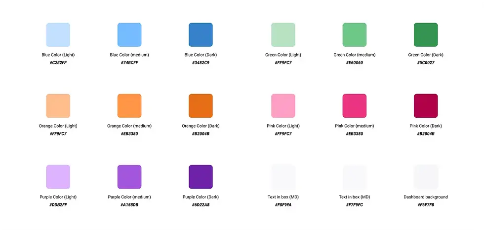
Integrated new primary color, hot pink (#e60060), in line with brand guidelines on buttons, spinners and other graphic elements, including the button corner radius and different states.

Research
To accomplish these objectives, the product design team adopted a strategic approach, involving:
-
Refreshing design system with new color palettes.
-
Applying these colors to buttons, sidebars, and more.
-
Broadening color palettes for clear widget associations.
-
Introducing new widgets for enhanced compatibility.
-
Enhancing dashboard clarity through dark mode redesign.
Opportunities to improve the product
-
Enhancing the design system and visual elements with the new brand.
-
Reducing cognitive overload in the user experience.
-
Enhancing the overall cohesiveness of the dashboard's appearance.
-
Improving button contrast and other elements.
-
Introducing new colors for improved aesthetics and exploring new options.
-
Implementing new micro-interactions to enhance user delight and overall user experience (UX).
-
Designing new icons and refining the organic product feel.
The Challenge for team
-
Balancing changes to preserve familiarity for existing users.
-
Adapting existing interface to match SOLVE's new brand post-rebrand.
-
Led rebranding process, ensuring efficient and seamless implementation.
-
Prioritizing user comfort while aligning with the new brand's vision.

New Widgets, New Colors
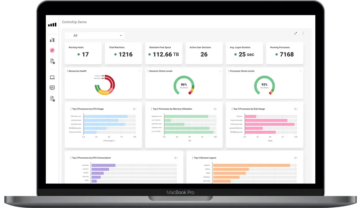
Changing the entire widgets collection
-
Implemented the new color palette on all new widgets, reducing cognitive overload.
-
Associated each color with specific widget categories for clear identification (e.g., CPU, Memory).
-
Enhanced contrast for improved legibility and accessibility by adjusting values.
-
Established a clean and coherent design throughout the entire product, forming a unified structure.
Initial Color Palette

Final Color Palette - Accesibillity check
Checking new colors for clear differences improves accessibility by making the interface easier to see and understand, especially for those with visual challenges.

New Graph Researching


Iconography
Ensuring visual consistency
In the beginning, I experimented with FontAwesome, a component of our website's design system. However, due to the absence of specialized icons, we opted for custom-made icons, which posed other challenges such as Inconsistencies in stroke weight, design, and size emerged.
-
To remedy this, I developed new icons, resulting in a more cohesive and enhanced design experience.
-
Ultimately, visual unity was achieved, imparting a harmonious and integrated appearance.
-
I Designed new icons that blend seamlessly with the overall design. Assigned distinct colors to widget categories for easy identification and adjusted contrast for better visibility.
Dark Mode
Updating the existing dark mode
-
Existing dark mode had issues: lacked visual contrast (not even AA), used outdated colors from the older interface (SOLVE), etc.
-
I Identify and address these pain points.
-
Contrast enhancement resulted in up to 147% improved readability and visual appeal across the entire dashboard.


Updating the design system with the new colors
-
Introduced new colors to the product following new brand guidelines.
-
Implemented these colors into diverse monitoring elements' color palettes and specific widgets.
-
Applied the new colors to relevant icons and buttons for a cohesive visual identity.

New features
-
The previous design had a simple switch, like a light switch at home, to change the screen colors between light and dark mode.
-
While working on improving the dark mode, I had another idea to make it even better.
-
I added a special feature that lets the colors change by themselves, depending on whether it's bright or dark outside.
-
This makes it easier for people to see and use the screen, and it's like the screen knows when to be light or dark all by itself.
The Result
-
Dex introduced new color schemes, enhancing appeal and reducing cognitive load for a soothing design.
-
The dashboard's overall appearance became more organic through updated elements and color palettes.
-
The brand's colors are now prominently showcased, forging a connection between the product and the company's website.
-
Improved legibility of dashboard buttons and elements.
-
Collaboration with SDRs and stakeholders yielded positive feedback on the enhanced user experience.

Credits
Thanks to this incredible team, we've had a significant impact on the product. I'm excited to witness its growth and improvement. My role in generating ideas, solving problems, and executing solutions was invaluable, and I'm proud to be part of it.
-
Enlarging and animating loaders for better attention.
-
New purple-orange-yellow gradient for brand alignment.
-
User understanding: data loading and wait assurance in two clear sentences.


My Suggestion

By simply making a few small changes, the loader became something completely different.
Improving User Experience
Loaders, process and micro-copy
The current interface had shortcomings in processes involving loaders
-
Pale and small loaders, hard to notice.
-
Lacking extra info, can be fixed with brief sentences.
-
No brand or identity shown.